Try paint and wallpaper on your walls.
A paint chip tells you about pigment. Your wall tells you about pigment plus daylight, floorboards, greenery and four metres of uninterrupted surface. New Walls lets you judge the second thing from one photo of the room you already have.
Why a paint chip lies
A swatch is roughly the size of a playing card, held at arm's length, usually under a shop's fluorescent strip. Almost nothing about that matches the wall it is meant to predict. Colour is not a fixed property of a tin: what reaches your eye is the pigment plus everything the light touched on the way, which in a real room means the oak floor, the jute rug, the leaves in the corner and the sky through the window.
Area changes it again. A colour spread across a whole uninterrupted wall saturates in a way the same colour never does on a card, because the wall bounces its own light back into itself. Mid-tones deepen. Warm greys pull pink. A sage that read calm on paper can turn cold on a north-facing wall by four in the afternoon. This is why people paint test patches, and why test patches are still unsatisfying: two coats, a day of drying, and you have tested exactly one colour.
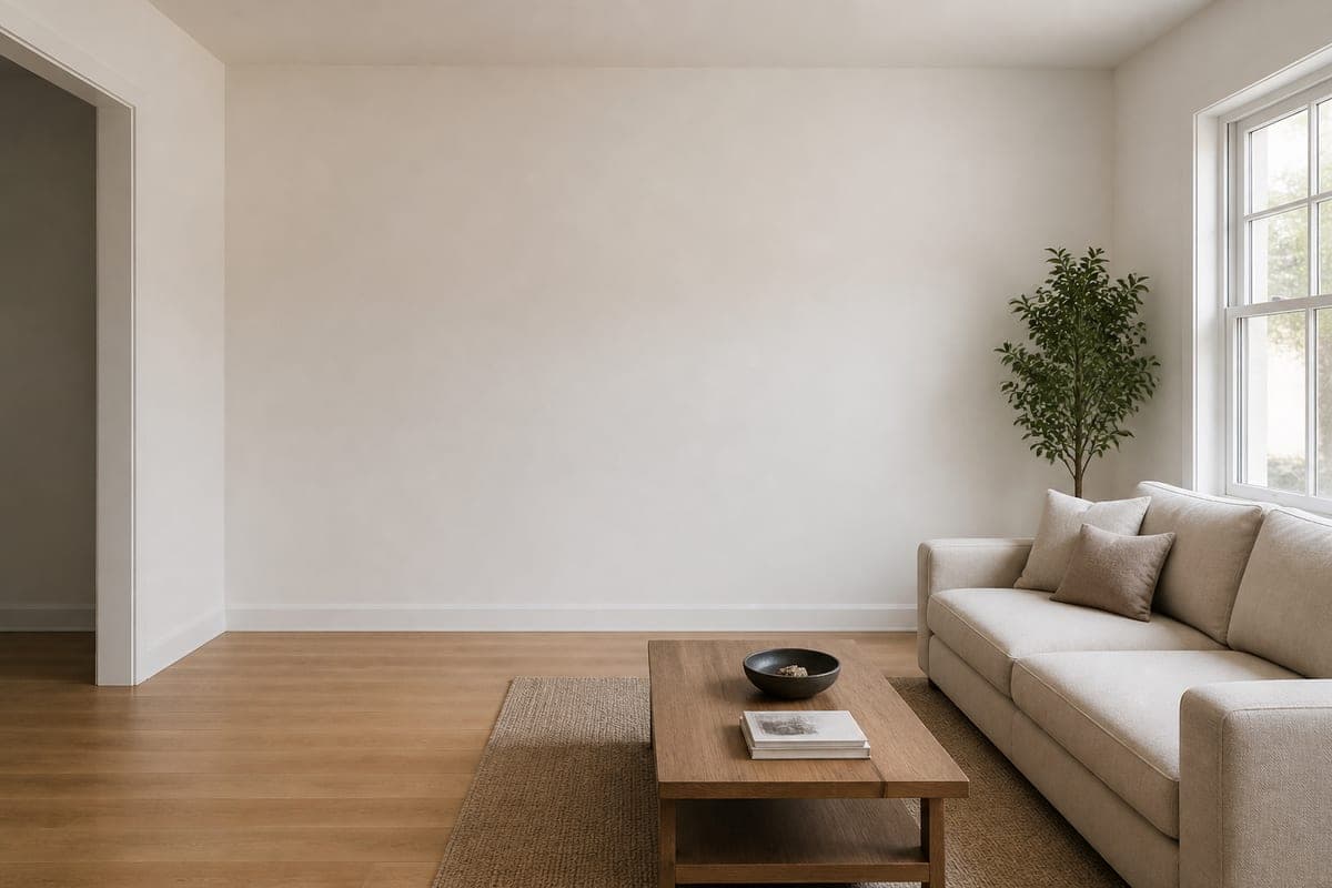 As shot
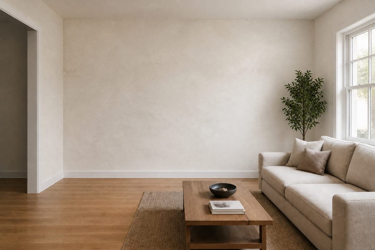 Limewash
What the tool actually changes
New Walls takes one photo of the space, furniture and all. Only the wall surfaces are repainted or repapered, and nothing else in the frame is touched. Woodwork keeps the colour it was, the ceiling and the floor stay where they were, every stick of furniture holds its own pixels, and the camera does not shift an inch, so the two images sit on top of each other cleanly. That is the whole point of the tool. A colour test is only a test if the wall is the one thing that moved.
Two details do more work than the colour choice itself. The first is sheen. A wall gives back only as much of the daylight already in your photo as that particular material would, so a matte emulsion swallows the window while a glossy paper throws it straight back at you. The second is occlusion. Anything standing in front of the wall interrupts the new finish rather than being painted over, which is what stops a mural from ghosting through the back of a sofa. If your room is cluttered enough that the walls barely show, it is worth running a pass that clears the furniture out first, then testing colour against the empty shell.
Naming a colour so it lands
The single most common mistake is naming a colour and stopping. Sage. Terracotta. Navy. Each of those covers a range wide enough to contain both the finish you wanted and the one you would repaint. A useful name carries three things: the hue, a qualifier that narrows it, and the finish it is applied in. Sage on its own could be half a fan deck. A greyed-down sage that stays cool in shadow, in a low-sheen finish, is one specific wall. Terracotta on its own could be a plant pot. A dusty, chalky apricot version of it, flat rather than shiny, is a decision you can look at.
Finish is doing at least as much as hue. The same pigment in matte emulsion, in eggshell and in limewash gives you three genuinely different walls, because each one handles the light from that window differently. Matte swallows it and reads flat and chalky. Eggshell holds a low sheen that lifts a colour half a step. Limewash is the interesting one, because it is barely a flat colour at all. It clouds. It goes a shade deeper where the brush turned and a shade lighter where it lifted, so what you are choosing is a texture as much as a pigment, and that is precisely what the pair of images above is showing.
The custom field takes any phrase you like, so nothing confines you to the presets. Write what you would tell a decorator standing in the room. If you would rather talk the change through than compose the phrase yourself, the design chat is the other route into the same edit.
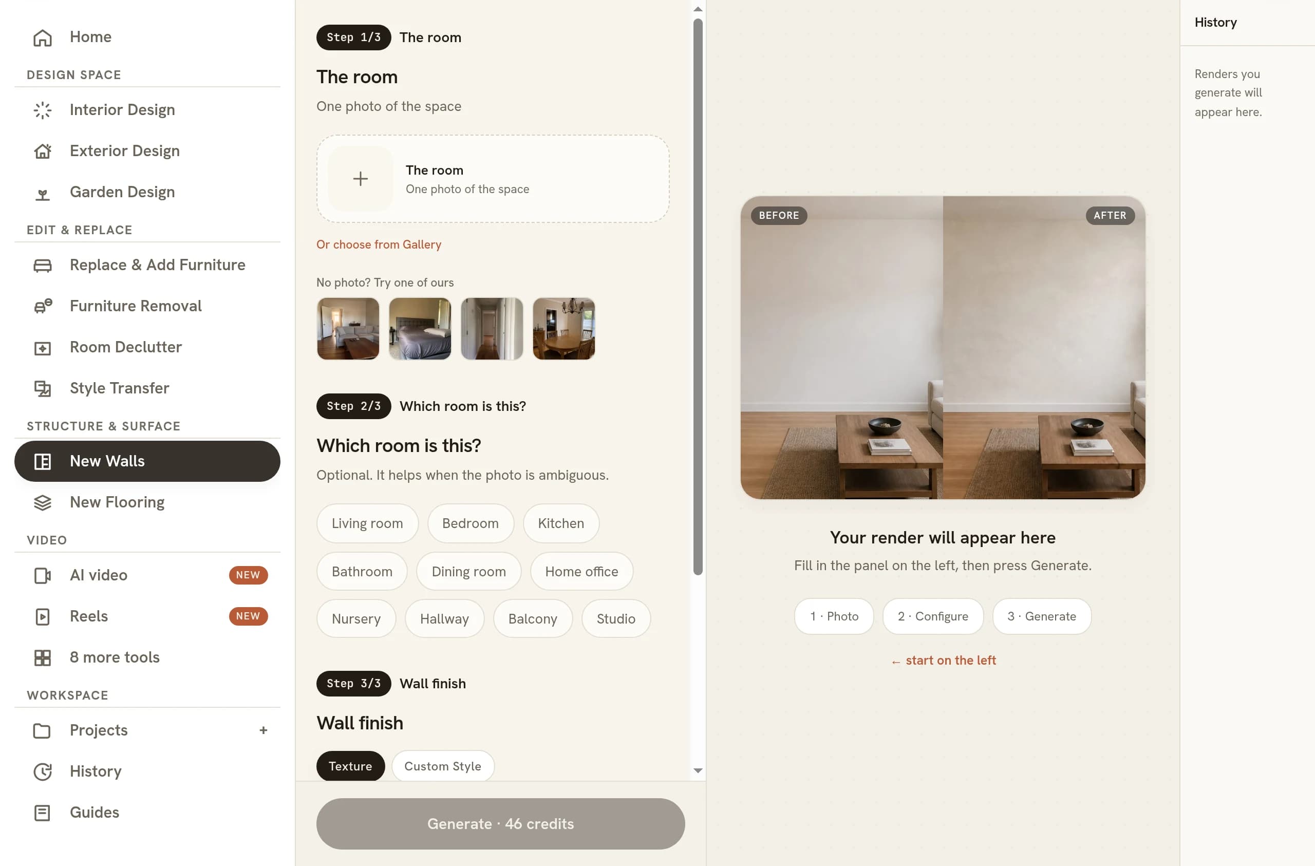
Paint, plaster, paper and cladding
The presets fall into four groups, and it is worth knowing what each one is for before you start clicking. Paint covers the safe territory: warm off-white, deep charcoal, sage green, clay, terracotta, deep navy and forest green. These are the colours a client can imagine living with, and the off-white is the sensible default when you want a room brightened rather than restyled.
The finish group swaps paint for plaster and mineral surfaces: limewash, microcement, Venetian plaster and a textured render. These read as expensive because they carry depth instead of a single flat tone. Microcement is the quiet one; Venetian plaster is the show-off, and in a north-facing room it can turn colder than you expected. They all photograph very differently depending on the hour, which makes them worth pairing with a change in the time of day once you have chosen one.
Paper is where the tool earns the most attention, because wallpaper is the hardest thing in a house to imagine from a sample book. The four here are grasscloth, a fine stripe, a damask and a botanical mural. Grasscloth is the one people misjudge: a natural woven material, so it brings a grain you can read from across the room and joins you are meant to notice. Pattern scale is the thing a sample cannot tell you. A motif that looks delicate on an A4 page can dominate a small room completely, and seeing it at true size against your own ceiling height answers that on sight. Cladding is the fourth group: painted panelling, fluted timber slats, and brick under a thin coat of white.
What to check before you commit
Open the original and the new version side by side and look at the corners first. A repeat should shrink as the wall runs away from you, sit at a believable size for a room this big, and carry on cleanly where two walls meet and where the wall stops at the ceiling. A stripe that changes width as it crosses the room is the giveaway. Check the skirting and the architrave next, since they should still be the colour they were, and check that the shadow under the sofa is unchanged.
Then judge the colour honestly. Look at it at full size on a decent screen, not as a thumbnail, and look at it near the window and in the darkest corner of the same wall, because those two readings are what you will actually live with. Compare your candidates against each other rather than one at a time. Colours assessed in isolation all seem reasonable; ranked as a set, the wrong ones fall away fast.
None of this replaces a physical sample for a paper you are about to buy. Texture, weight and the way a finish takes a scuff still want a hand test. What it replaces is the early part of that process, where you are narrowing a long shortlist down to the two worth ordering.
Where a wall change fits in the wider job
For a stager or an agent, walls are among the cheapest visible upgrades in a property, and a dated feature wall is often the only thing standing between a room and a decent photograph. Testing the repaint before quoting for it is a straightforwardly commercial use of the tool, and it sits alongside the rest of a stager's workflow rather than replacing any of it. Be careful with the claim you are making, though. A repainted photo on a live listing describes work that has not happened yet, so label it as a visualisation.
For your own home the calculation is simpler. The cost of getting a wall colour wrong is a weekend, a couple of tins and a mild grudge, and the cost of testing it here is one photograph taken on the phone in your pocket. Shoot the wall square on, in daylight, with the furniture where it lives. The rest of the room is what makes the answer trustworthy, which is why the tool is built to keep it in. If you are working entirely from a handset, the same edits run there: designing a room from your phone covers the shooting side in more detail.
Common questions
Is there an AI paint colour visualiser that uses my own room photo?
Yes. Give it one photo of the room and a description of the finish you want, and the colour lands on the wall surfaces alone. Woodwork, ceiling, floor, glazing and every piece of furniture come back untouched, and the camera does not move, so the result reads as your own room repainted rather than a new room.
Can I match a specific paint brand shade?
Describe it rather than name it. The wall finish field accepts any phrase, so a manufacturer's shade goes in as its hue, its depth and its sheen: a deep blue-green in eggshell, say, or a chalky mid-grey in matte emulsion. A shade code on its own carries no information, while a description of colour plus finish lands consistently.
Can I try wallpaper on a wall without ordering a sample?
You can. Paper, grasscloth, panelling and fluted cladding behave here exactly as paint does. A repeat is drawn at the size it would really be on a wall that height, it narrows as the wall recedes, and it turns a corner instead of stopping at one. Order a physical sample once you have a shortlist, since paper weight still wants a hand test.
Will the furniture move when I change the wall colour?
No. The edit is confined to the wall planes themselves, so the sofa, the rug and the coffee table hold the same pixels and keep their shadows. Objects sitting against the wall occlude the new finish the way they would in a photograph, which is what leaves the before and the after directly comparable.
Can I try several wall finishes on the same room photo?
Yes, one finish per run. Give the same photo again with a different colour or covering named, and keep each result. Because the camera, the furniture and the floor are fixed every time, the outputs stack into a set that can be ranked against each other rather than a pile of loosely related images.
Try it on your own plan
Upload a floor plan or a room photo and see the first renders in about thirty seconds.
100 free credits · no credit card required
Get the next guide when it lands
We publish these as we work through what people actually ask about pricing, staging and turnaround. Leave an address to hear when a new one goes up.
We only use your address to email you about RoomGen. Privacy policy · Terms