Match a room to an inspiration photo.
Style Transfer takes two photos: a room whose look you want, and the room you want it applied to. The palette, the materials and the mood cross over. Your walls, your windows and your furniture stay exactly where they are.
Two rooms in, one room out
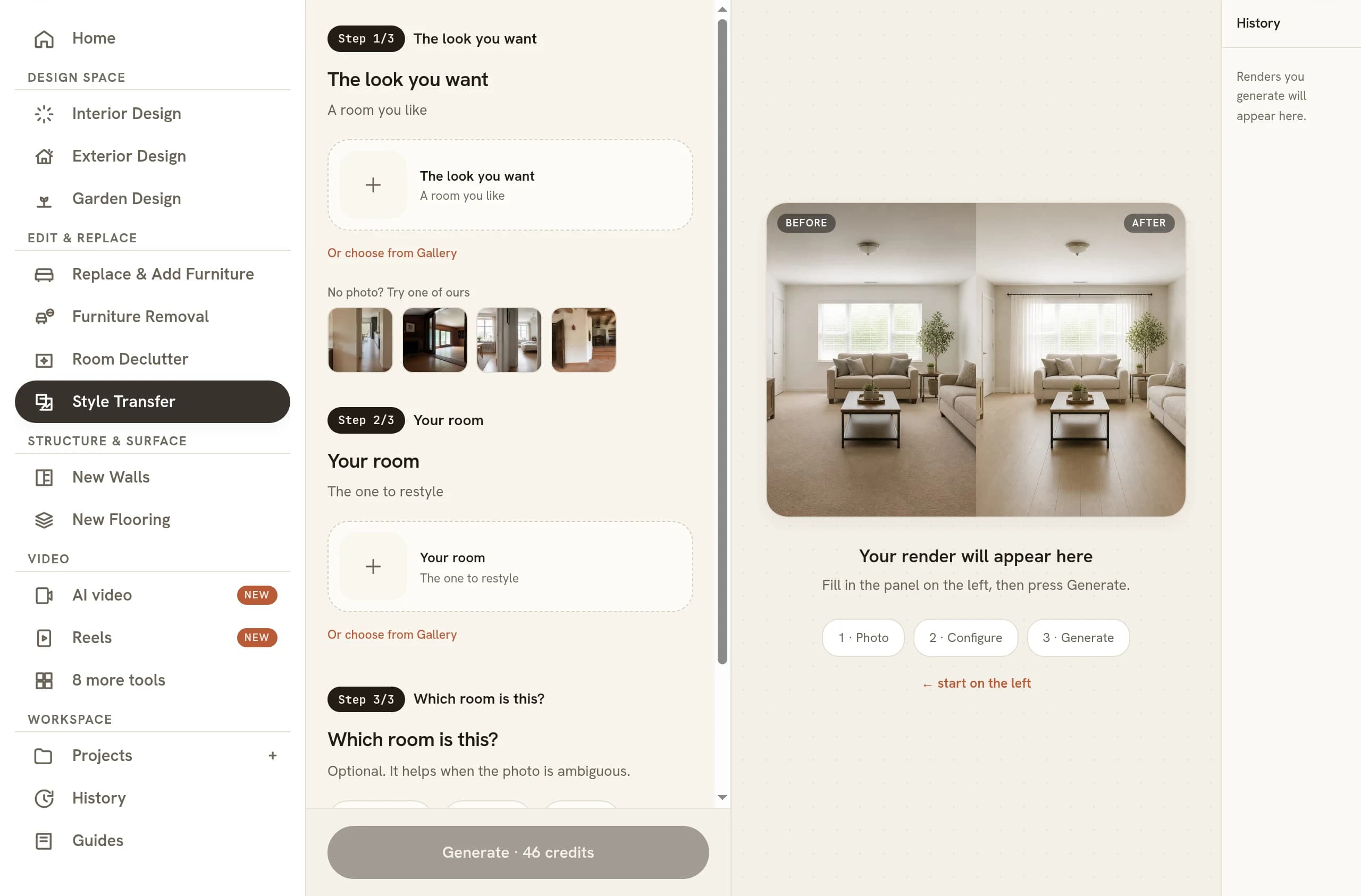
The tool asks for two uploads and names them plainly on the screen. The first slot is the look you want, meaning a room you saw somewhere and saved because something about it landed. The second is your room, the one that is going to be restyled. Nothing literal is taken from the reference: not its sofa, not its floor plan, not its camera angle. What travels is the way it looks, and the room that comes back is still yours.
That is a narrower promise than it first sounds, and the narrowness is what makes it useful. A picture carries decisions about colour, material and restraint at a density nobody can dictate reliably in a sentence, so handing over the photograph you already saved is a far more accurate brief than any description you could write of it. The reference does the explaining. Your room supplies everything else.
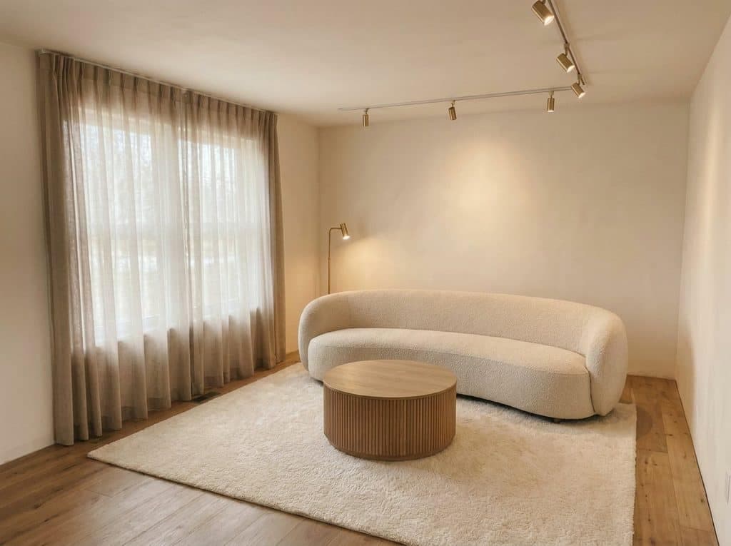 As shot
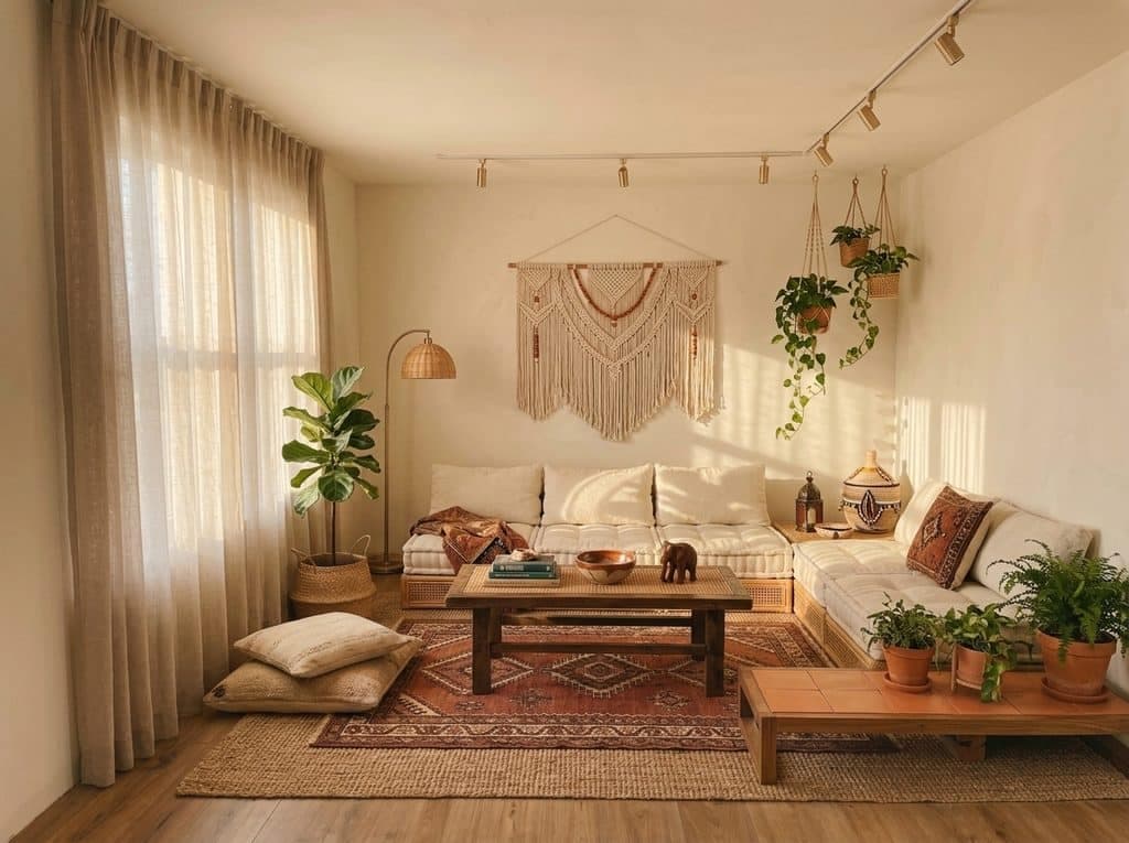 Styled to the reference
Read that pair the way a client will. Nothing moved, so the two images can be compared honestly, and the only argument on the table is the finish. That is the whole point of feeding a picture rather than a word: you stop negotiating over what warm minimalism means and start looking at the same room twice.
What actually transfers
Five things carry across from the reference, and they happen to be the five that a photograph communicates far better than any sentence written about it ever will.
- Colour palette. The dominant hues and how warm or cool they run, taken as a family rather than as individual paint codes.
- Materials and finishes. Timber tone, stone, metal, plaster, the difference between a matte wall and a chalky one. This is usually the change you feel first.
- Textile weight. Whether the room reads as linen and bouclé or as leather and heavy wool, which sets almost all of its softness.
- Level of ornament. How much the room carries. A spare reference strips your surfaces back, a layered one gives them more to hold.
- Quality of light. How soft or crisp the light reads, which is not the same as where it comes from.
None of that involves moving your furniture. A piece is refinished where it stands, or swapped for a close cousin of itself in the timbers and fabrics the reference favours. A dark console becomes a pale one and stays a console, in the same spot, at the same scale. Every piece keeps the job it was doing in the room, so a three-seater does not become a daybed and a dining chair does not quietly turn into an armchair on its way through.
Taken together those five qualities are most of what people mean when they call a room a look, which is why a reference that is strong on all five transfers so convincingly and one that is strong on none of them produces a result you struggle to tell from the original. The reference is doing real work here. Choose it accordingly.
What cannot cross over
Layout does not transfer. Nor does architecture, window position, ceiling height, camera angle or the direction the light falls from. The reference is read for its look and then set aside, because a room that borrowed the reference geometry would no longer be a picture of your space.
This is worth saying out loud to anyone who sends you an inspiration shot, because the disappointment always comes from the same place. Someone loves a room for its double-height glazing and its long sightline, and neither of those is a style. If you do want the arrangement itself reconsidered, that is a different job, and deciding where the furniture goes is the guide for it.
Holding all of that fixed is also what makes the output usable as evidence. Because the camera, the proportions and the furniture positions survive untouched, the before and the after can sit next to each other in a proposal without either of them needing an explanation, and a client can see precisely which decisions changed and which did not. A restyle you can compare is worth more than a beautiful picture of somewhere else.
Choosing an inspiration shot that will transfer
The best reference is an ordinary wide photograph of a whole room in daylight. Not a close crop of a cushion, not a flat-lay, not a moodboard collage. The tool needs to see surfaces at room scale to work out what the floor is, what the walls are and how heavy the fabrics run.
Prefer a reference that tells one coherent story about itself. A room that is confidently one thing transfers cleanly; a room combining three ideas transfers as an average of them, which is nobody’s favourite outcome. Watch for heavy colour filters too, because a strong grade reads as the palette and your room will inherit the filter rather than the scheme.
Then ask the honest question about the shot you picked. If you cover the architecture with your hand and the room still appeals, the appeal is in the finishes and it will travel. If what is left looks unremarkable, what you admired was the building, and no amount of restyling will bring it to a standard rectangular lounge.
Resolution matters less than framing, though a reference large enough to show the grain of a floorboard and the weave of a curtain gives the tool more to work from than a compressed thumbnail saved off a feed. Daylight helps for the same reason, since a room photographed at night under warm lamps describes its own materials far less clearly than the same room in the morning. Pick the cleanest copy you can find.
Getting your own room ready
Shoot the target room straight, from a corner, with the daylight already in it and the blinds open. The output inherits your light direction and your shadow softness exactly, so a dim phone snap restyles into a dim room in a nicer palette. One clear photo of the space is the whole input, so it is worth spending a minute on the photograph itself.
Clear the room out first if it is busy. Laundry, boxes and cabling all survive a restyle as better-finished laundry, boxes and cabling, so it is worth taking the clutter out of the photo before you transfer anything onto it. When the result arrives, compare it against the original at full size: check that every piece landed in its old position, that the window kept its view, and that nothing quietly changed size, which is the failure worth knowing about in any generated interior.
When to name the style instead
Style Transfer earns its place when you cannot name what you want. You have the picture, the picture is the brief, and a paragraph of description would only lose information. If you can name it, though, naming it is faster: Interior Design takes one photo of your room plus an aesthetic such as Japandi or Coastal, and skips the reference upload entirely.
The two also work in sequence. Transfer a look you found, then adjust what you got by talking the room through the changes until the palette lands, all from the phone you photographed it on. A good reference gets you most of the way there in a single step. The rest is a conversation.
Common questions
Can AI make my room look like a Pinterest photo?
Yes, though what returns is your room in that photo's finishes, not a copy of the photo. Upload the save as the reference and your space as the target. One caveat: Pinterest saves are often tight crops, and a crop of a cushion gives the tool almost nothing to read, so track down the wider frame of the same shoot where you can.
Does the inspiration photo have to be the same kind of room?
No, and it often should not be. A palette and a material story carry across room types perfectly well, so a kitchen can style a hallway and a hotel lobby can style a lounge. Matching the room type only matters when the thing you actually admired was the furniture itself.
Can I use a photo from a magazine or a catalogue as my reference?
Technically it works, since the reference is only read for its look. Commercially, be careful. A scan or a screenshot belongs to whoever shot it, and while nothing of it is reproduced in your output, the safer habit is a reference you photographed or one you are licensed to use.
Can I try several inspiration photos on the same room?
Yes, and comparing two or three references against one room is the fastest way to find out what you actually liked. Keep the room upload identical and swap only the reference, so the difference you see between results is the reference and nothing else. Each attempt is its own generation.
Why does my result still look like my room instead of the inspiration?
By design: the tool restyles rather than rebuilds, so your geometry survives on purpose. If genuinely nothing changed, the fault is usually the reference. A photo whose palette already sits close to yours, or one shot flat under weak light, has little to hand over. Pick a reference that differs sharply in timber tone or textile weight and run it again.
Try it on your own plan
Upload a floor plan or a room photo and see the first renders in about thirty seconds.
100 free credits · no credit card required
Get the next guide when it lands
We publish these as we work through what people actually ask about pricing, staging and turnaround. Leave an address to hear when a new one goes up.
We only use your address to email you about RoomGen. Privacy policy · Terms