See it decorated before the boxes come down.
Upload one photo of the room, name the occasion, and it comes back dressed for it. The walls, the floor and the furniture stay exactly as shot, so what you are comparing is the decoration and nothing else.
Decide the scheme before you carry anything down
The usual sequence is backwards. You bring the boxes down, spend an evening putting the tree where it went last year, and only then discover that the corner is wrong, that the lights fight the wall colour, or that the garland you liked in the shop reads as clutter on your own mantel. The Holiday decorator moves that discovery forward. One photo in, one decorated version of your room out. Nothing is unpacked, nothing is bought, and nothing has to go back into the loft in January because it turned out to look wrong against the wall it was hung on.
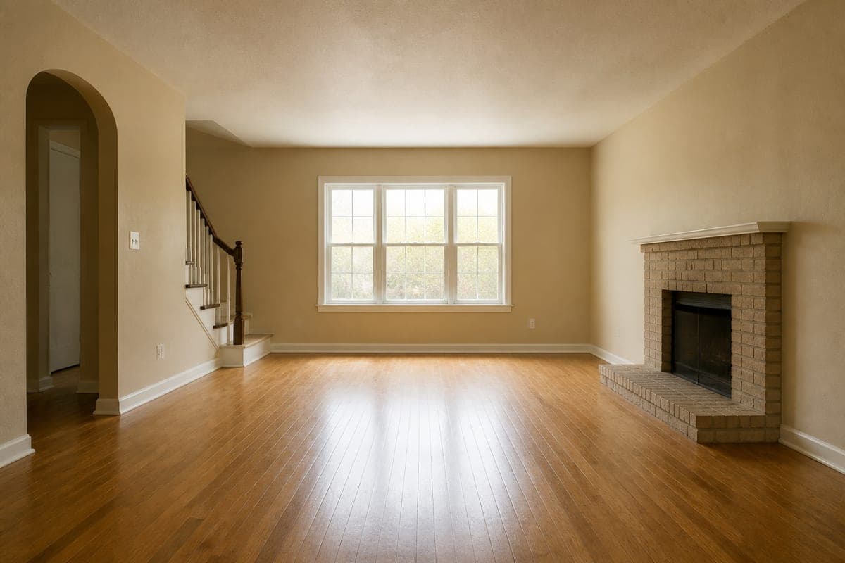 As shot
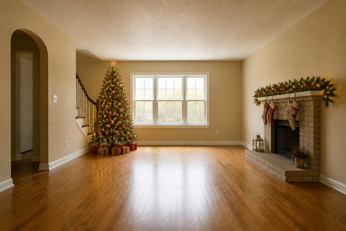 Christmas, warm white
Look at what did not change in that pair. The arch on the left, the newel post, the sill height, the sheen on the boards: all identical. That is the whole point of the tool. You are not looking at a room like yours from a catalogue, you are looking at yours.
The room stays put so the decorations can be compared
Every holiday render is built on one restriction: the room you photographed is off limits. Your sofa keeps its spot, the picture keeps the angle you shot it from, and the only thing the model is free to add is the dressing. That restriction is what makes a comparison possible. Generate three schemes and the difference between them is decoration, because nothing underneath was ever in play.
It is the same discipline behind changing the time of day in a render: hold the room, move one variable, and the answer means something. Two versions of a mantel in the same photograph tell you which garland to buy. Two mantels in two different houses tell you nothing at all.
This also settles an argument that usually runs on memory. Somebody remembers the tree being fine in the far corner last year and somebody else remembers squeezing past it every time they went to the kitchen, and neither of them has a picture. Two renders of the same room end that conversation, because both memories are on screen at once and one of them is visibly wrong.
Where the tree actually goes
Tree position is the decision people get wrong, and it is expensive to get wrong because reversing it means undressing the tree. Most rooms have two or three candidate positions. In the room above they are the corner by the staircase, the wall beside the window, and the space facing the fireplace. Each one is a different room to live in for the whole season.
Generate the same room with the tree in each position and read three things. What the tree hides, which in that room is a stretch of blank wall in one position and half the window in another. What it blocks, meaning the walking line from the arch to the fireplace. And how it balances the fixed heavy object in the room, which here is the brick chimney breast on the right. A tree in the far corner leaves the right side of the room carrying all the visual weight.
The position by the window is the one that rewards a preview most, since it looks generous in daylight and changes character completely once the lights are the brightest thing in the room after dark. A corner position is the safer answer in a room people walk through, because the tree stops competing for floor with the route between two doors.
If the corner you are considering currently holds an armchair or a stack of boxes, take it out first with furniture removal on the photo, then decorate the cleared version. Otherwise you are asking whether the tree fits a corner you have not actually offered it.
Light temperature against your own wall colour
Warm white, cool white or coloured is the second decision, and it is never answered in the abstract. It is answered by your paint. The room in the pair above has warm cream walls and mid oak boards, so warm white lights melt into the wall and read as a soft glow, while cool white would sit against that cream as a faintly blue intrusion. On a grey or chalk white wall the same two options swap places entirely.
Because the render keeps your real wall colour, you are testing the combination you own rather than the one in the product photograph. Say the temperature explicitly in the occasion field: warm white fairy lights, or cool white and silver with no red, or coloured bulbs on the tree and warm white on the mantel. Then compare the versions side by side at full size, where the difference is obvious and easy to judge.
Not only December
The occasion is free text, not a Christmas switch, and that makes the tool useful across the year. Your hallway with diyas along the sill and marigold at the door. The living room set for a child's birthday, so you can see how much of the ceiling the balloons want. A porch and front room done for Halloween, decided in daylight in October rather than in a rush on the night.
The same question applies to all of them: how far to go. Decoration is easy to overdo in a small room and easy to underdo in a tall one, and both mistakes are cheaper to make on screen. Previewing also makes the shopping list honest, because you can see whether you need one long garland or two, and whether the scheme you already own covers the room without another trip.
Hosts get a second use out of it. A room dressed for a party looks different from a room dressed for a family evening, and seeing the difference before the guests arrive is the difference between a plan and an improvisation with sticky tape.
Writing the occasion line
The field opens with a whole sentence already typed into it rather than a single word, and that is the shape worth keeping. Name the event first, then two or three things you genuinely care about, which is usually the colour of the light, where the tree stands and the palette. A fortieth birthday in black and gold, with balloons clustered at the ceiling instead of strung across the room, gives the render something to work from. A one word input returns a generic answer, and a generic answer is exactly what you came here to avoid.
When each version comes back, check four things. The room underneath is untouched, so the window and the skirting are where they were. The tree is a sensible height against the ceiling, since scale is the detail worth a second look. Any decorative lighting throws believable glow onto the surfaces nearest it. And the palette still works against the wall colour when you view the image at full size rather than as a thumbnail.
You can run the whole exercise from the sofa, since designing a room from your phone needs only the camera you already have. Describe what you want in plain words through the interior design chat if a scheme is easier to talk through than to specify, and turn the finished render into a video when the version you settled on deserves more than a still.
Common questions
Can I see what my room will look like decorated for Christmas?
Yes. Give the tool a single photograph of the room and the occasion you are planning for, and the same walls, floor and window come back with a tree, garland, lit mantel and wrapped presents in place. You can generate several versions of the same room and keep the one that works.
What photo should I upload for a holiday preview?
One clear, straight photo taken in daylight, with the corner or mantel you are thinking about fully in frame. Stand back far enough to include the floor and the ceiling line. Avoid heavy backlighting and extreme wide angles, because both distort the scale the decorations are matched to.
Will AI holiday decorations look fake?
Not if you check the two joins that give a weak render away. Look at where the tree meets the floor, and where the garland wraps around the front edge of the mantel. Contact shadows and a wrapped edge read as real; a decoration that sits flat on the surface does not. Discard those versions and generate again.
Can I preview decorations for Halloween, Diwali or a birthday?
Yes. You type the occasion yourself, so Halloween, Diwali, Eid, Easter, a christening or a fortieth birthday are all valid inputs. Name the event and the accents you have in mind, such as pumpkins and cobwebs rather than a tree, and the room comes back dressed for that one event.
Is it worth previewing if I put up the same decorations every year?
It is worth it whenever the room changed. New paint, a new sofa, a rearranged corner or a move to a different house all change how last year's scheme reads. A preview tells you whether the box of red and gold still suits the wall it now hangs against, before you spend an evening finding out that it does not.
Try it on your own plan
Upload a floor plan or a room photo and see the first renders in about thirty seconds.
100 free credits · no credit card required
Get the next guide when it lands
We publish these as we work through what people actually ask about pricing, staging and turnaround. Leave an address to hear when a new one goes up.
We only use your address to email you about RoomGen. Privacy policy · Terms