See your room in another decade.
Pick a year and the same room comes back styled for it, with the walls, windows and camera exactly where you left them. The useful part is not the novelty. It is learning which details genuinely date a room and which ones only read as fancy dress.
One photo, one year, the same four walls
The Time-travel room tool asks for two things: one clear photo of the space, and an era. Type a year into the era box and the room comes back styled for it. Nothing loose in the room is exempt. What you sit on and what you walk on both change, the walls pick up a finish that belongs to that year, the lamps and the screen become objects of their time, and the small things on the shelves follow. The camera angle, the room proportions, the windows and the doors stay put.
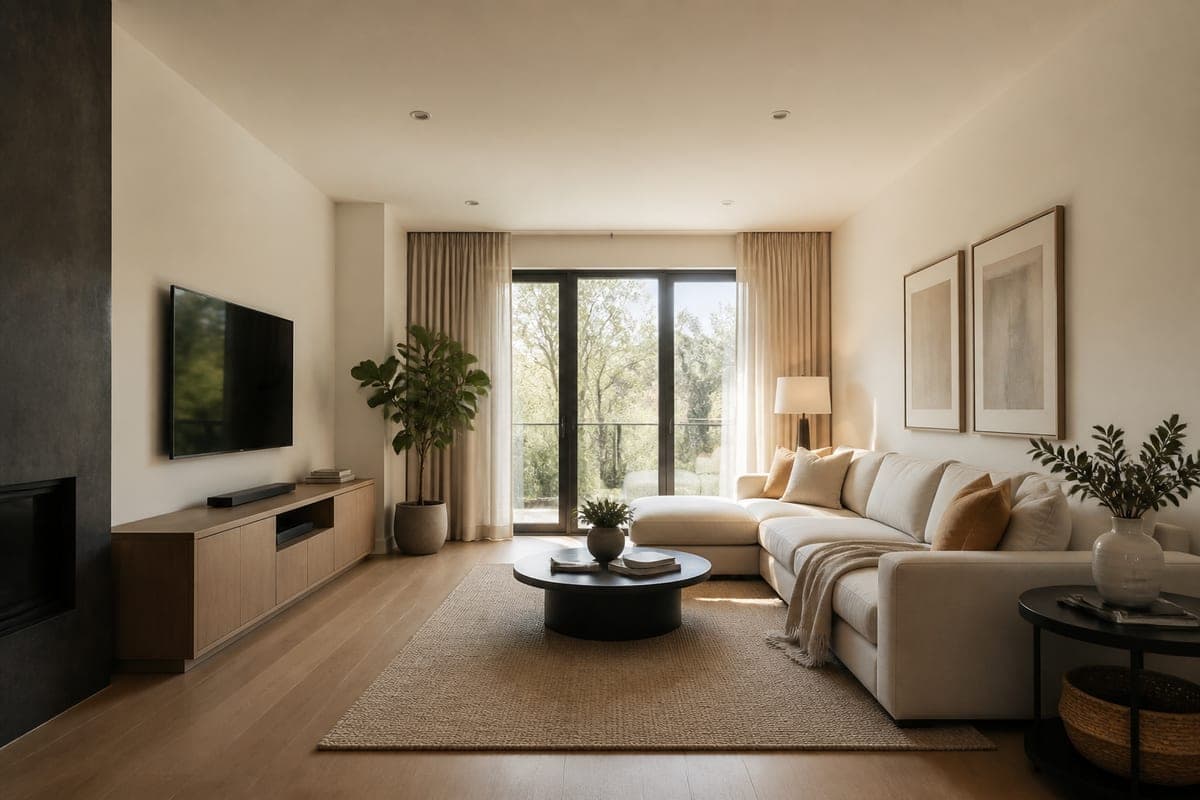 As shot
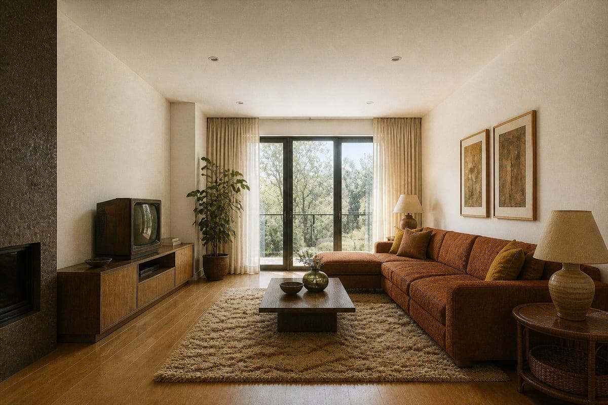 Styled for 1975
That fixed architecture is what makes the pair readable. Because the doors stay where they are and the ceiling keeps its height, your eye has something to measure against, and the change registers as a restyle rather than as a second photograph of somewhere else. A room rebuilt from scratch would just be a different room in period dress. This one is recognisably yours.
The markers that do the dating
Ask anyone to picture a seventies living room and they will name colours first. Colour is real, but on its own it is the weakest of the markers, because a warm palette in a room full of current furniture reads as a mood board rather than as a year. Three other families of detail carry more weight, and knowing which is which tells you whether a result has landed.
Technology is the loudest single object in most rooms. A television in a wooden cabinet with a curved glass screen dates a photograph faster than any cushion, and so does the absence of everything we now cluster around a screen. Materials come next: the depth of the pile underfoot, the weave of the upholstery, whether the timber is pale and matt or dark and glossy, whether the surfaces are stone or laminate. Lighting is the quiet one. Shade shape, lamp base material and bulb warmth place a room in time about as reliably as the seating does.
Then there is the photograph itself. The restyle asks for a picture that looks as though it were taken in the chosen era, with the film grain and colour cast that came with the equipment of the day. That is a genuine period marker and not a filter bolted on afterwards, which matters, because the cast has to sit on furniture that belongs to the same year to be convincing. Grain over a modern sofa fools nobody.
Where period accuracy turns into costume
Costume is what you get when a decade is told through its punchlines. Every surface carries a novelty object, the palette runs to its loudest version, and the room ends up looking like a set built for a scene about the past rather than a place someone lived. The tell is density. Real rooms from any year contain one or two things that date them and a great deal that is simply ordinary.
So aim for the ordinary version. A believable 1975 living room has a television, a sofa, a lamp and a rug, and the year shows in what those four things are made of rather than in a fifth object added to prove the point. The image above works that way. The wood-cased set and the rust upholstery carry the year, and the pieces around them, the shaded lamps, the shag rug, the low timber table, agree with it quietly rather than competing to announce it. No single object in the frame is there only to say seventies.
If a result comes back too theatrical, the fix is usually subtraction rather than a different year. Name the one or two anchors you want the era to hang on, then let the rest of the room stay unremarkable. Describing the room you want in plain sentences works better than stacking up references, which is the same habit that pays off in design chat.
Writing the era box
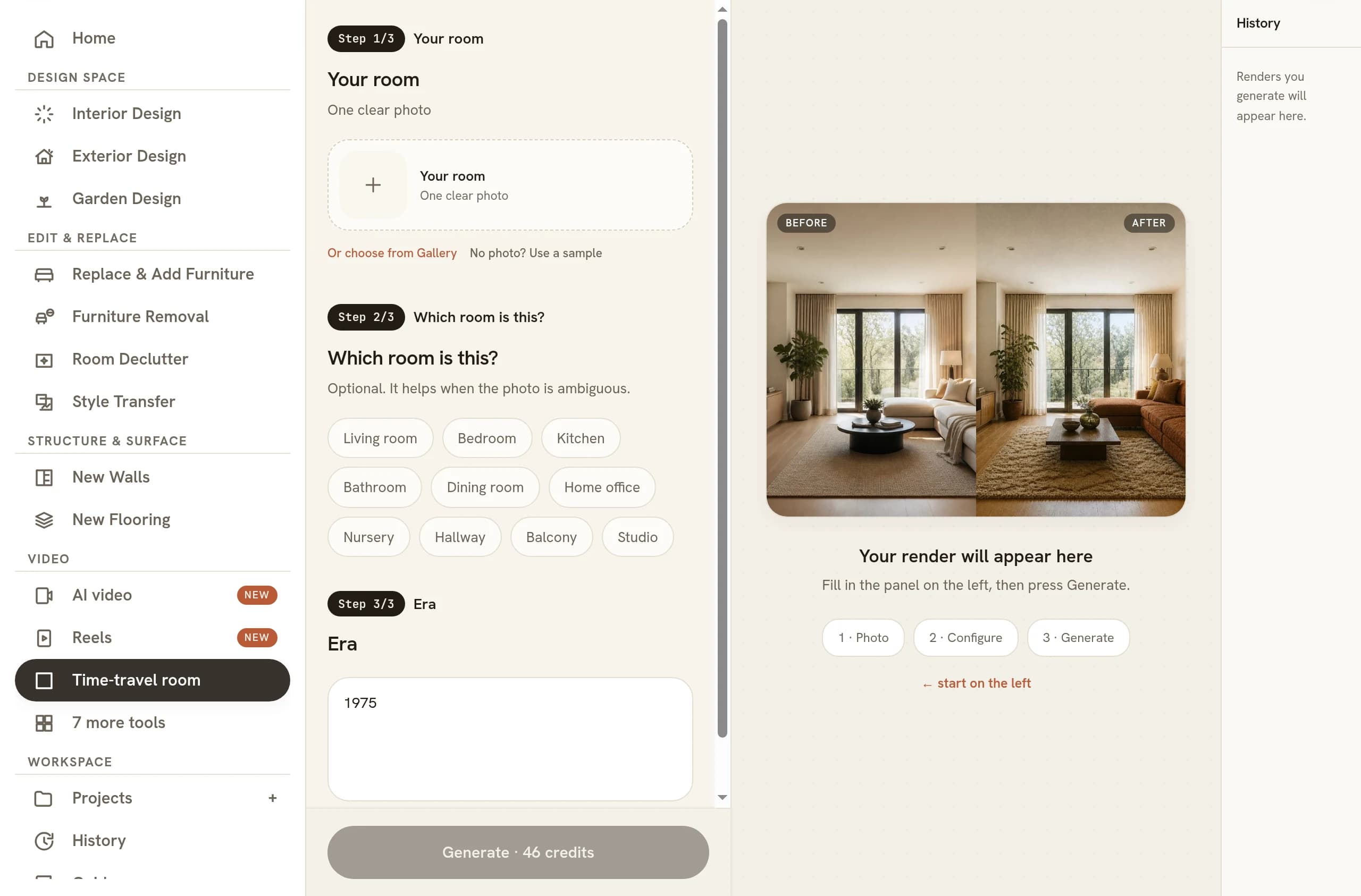
The era field is free text with 1975 sitting in it by default, and the suggestions run from 1975 through 1995 to 2090. A bare year is the strongest input, because it pulls in everything that was true of that moment: the products, the manufacturing, the palettes and the photography together.
A style label behaves differently. Asking for mid-century modern gets you the design movement, which is a curated slice of a period rather than a portrait of it. A real living room from 1958 contained a lot that no design book would show. Both answers are useful, so it helps to know which one you have asked for. If you want the museum version, name the movement. If you want the lived version, name the year.
Neighbouring years are worth running as a set. The gap between 1968, 1975 and 1979 is visible once you put three versions of the same room side by side, and the comparison teaches you more about what actually shifts than any single result does. It is the same trick as generating several lighting states of one room instead of settling for one.
A decade as a research step
Before you commit to a mid-century restyle in the real world, it is worth seeing whether your particular room carries the look at all. Low seating and heavy timber need ceiling height and floor area to breathe. Running your own space through the decade first answers that question with your proportions and your window rather than with a showroom's.
What you carry forward from that test is rarely a shopping list. It is ratios: how much wood the room wants against how much fabric, how deep the palette can go before the space feels smaller, how low the seating can sit before the window looks stranded. Take those observations into a normal restyle and you are designing with an informed brief instead of a hunch. If the room is cluttered to start with, clearing it out first gives the era a cleaner shell to work on.
The whole loop runs off a phone photo, which is what makes it a soft step rather than a project. Shoot the room from the doorway, try three decades, and you have your answer before anything is ordered. Designing from your phone covers how to take the picture so the restyle has something square to work with.
What to check before you keep one
Period work fails in specific ways, and a quick pass catches most of them. Open the original beside the result and look for these five things in order.
- The architecture held. Window mullions, door position and the ceiling line should land where they started. If they moved, the before and after stop being a pair.
- Nothing anachronistic survived. A modern downlight or a slim remote left in frame undoes an otherwise clean restyle, and it is easiest to spot at the edges.
- The furniture fits the room. Period seating is often deeper and lower than the current equivalent, so measure the result by eye against the doorway and the walking gaps, the same way you would when a render gets scale wrong in any other restyle.
- Cast and colour are separable. Decide whether a wall is really that shade or whether the warmth belongs to the film. It changes what you would actually buy.
- The grain is even. Photographic ageing should sit across the whole frame. Grain in the corners only means the treatment was applied rather than rendered.
None of this takes long, and the discipline pays off twice. A period render that survives the check is one you can show without explaining it, and the habit of separating a real material from a lighting effect is the same habit that keeps ordinary restyles honest.
Common questions
What would my room look like in the 1970s?
Warmer and heavier than it looks now. A seventies version of a modern living room usually arrives with russet or ochre upholstery, deep pile underfoot, more timber than white paint, shaded table lamps instead of downlights, and a television in a wooden cabinet. The photograph itself turns warmer too.
How many photos do I need to see a room in another era?
One. Time-travel room takes a single upload and nothing else, so a phone picture snapped from the doorway does the job. Frame a full wall and some floor if you can, since those two surfaces carry most of the period signal, and shoot in daylight so the restyle has real shadows to rebuild against.
Can you show a room in a future decade rather than a past one?
Yes. The era field is free text, so a year in the 2090s is as valid an input as one in the seventies. Future years behave differently, though, because no real photography exists for the tool to imitate. A past decade borrows a documented look, while a future one is invention, so read it as fiction rather than forecast.
Is this the same as putting a vintage filter on a photo?
No. A filter changes colour and grain while leaving your actual sofa, television and light fittings in place, which is why filtered photos still read as modern. Here the contents of the room are replaced first and the photographic treatment follows, so the objects and the film stock agree with each other.
How accurate are AI period rooms?
Accurate enough to be convincing at a glance, and strongest on the loud signals: silhouette, palette, materials and technology. They are weaker on specifics, so a named designer chair or an exact wallpaper pattern may come back as a close relative rather than the real thing. Check anything you plan to buy against period reference.
Try it on your own plan
Upload a floor plan or a room photo and see the first renders in about thirty seconds.
100 free credits · no credit card required
Get the next guide when it lands
We publish these as we work through what people actually ask about pricing, staging and turnaround. Leave an address to hear when a new one goes up.
We only use your address to email you about RoomGen. Privacy policy · Terms